
Website Sections
Sections are the content blocks that make up your pages. Each page can contain multiple sections arranged in any order. Website Studio offers a wide variety of section types organized into four categories: Content, Layout, Dynamic Content, and Interactive.
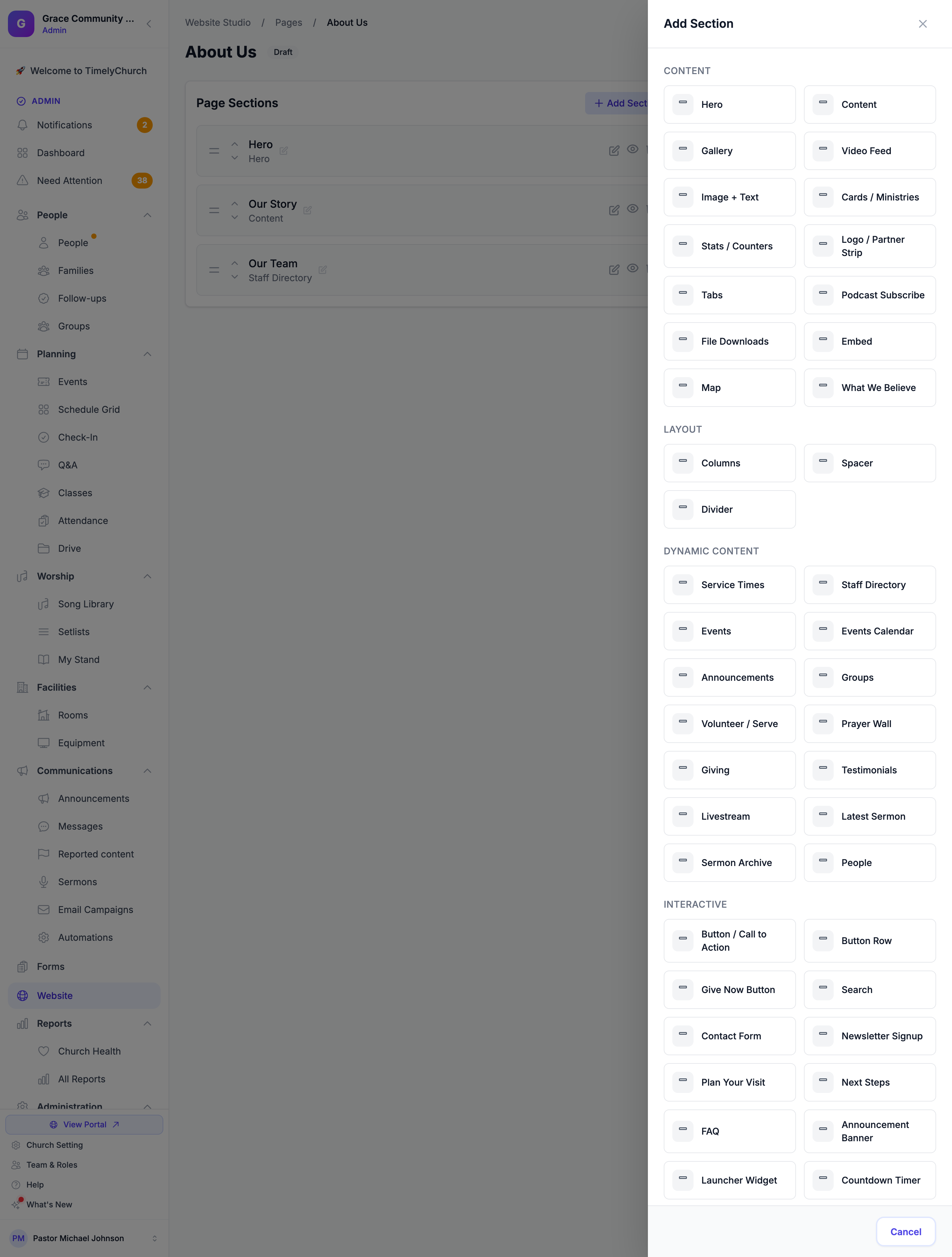
Section Categories
Content Sections
Static content blocks where you control the text, images, and layout.
| Section Type | Description |
|---|---|
| Hero | A large banner section with a background image, color, or video, headline, subheading, and call-to-action buttons. Ideal for the top of your home page. |
| Content | A rich text content block. Supports HTML for flexible formatting. |
| Gallery | An image gallery of uploaded photos and/or linked images, shown in a grid, masonry, or carousel layout. Upload many photos at once, each with an optional caption. Any tile can also hold a short video (YouTube, Vimeo, or an uploaded MP4/WebM) that plays on click. See "Inline Video in Gallery & Testimonials" below. |
| Image + Text | A single image paired with a heading and a rich-text paragraph (bold, italic, lists, links, headings), with the image placed on the left, right, or on top and styled by shape (square, rounded, or circle) and size. Great for a welcome note, a pastor's bio, or a "what to expect" blurb. |
| Cards / Ministries | A responsive grid of linked tiles, each with an optional image, a title, a short description, and a link. Perfect for a "Our Ministries", "Get Involved", or "Quick Links" block. Choose 2, 3, or 4 columns; links can point to a page on your site or an external web address. |
| File Downloads | A list of downloadable files (PDF, Word, Excel, PowerPoint, images, audio/video, or ZIP) shown as tidy download cards with a file-type badge and size. Upload your files and give each one a friendly label. |
| Video Feed | A polished grid of videos. Upload your own (MP4, WebM, or MOV), paste YouTube/Vimeo links, or auto-pull an entire YouTube channel or playlist that stays up to date on its own — shown with the privacy-friendly no-cookie player. See "The Video Feed Section" below. |
| Stats / Counters | Big animated numbers that count up as visitors scroll (members, baptisms, years serving), plus an optional giving-goal progress bar shown in your church's own currency. See "The Stats / Counters Section" below. |
| Logo / Partner Strip | A tidy row of partner, sponsor, or denomination logos. |
| Podcast Subscribe | A row of "listen on…" buttons linking to your podcast on Apple Podcasts, Spotify, YouTube, and more. |
| Tabs | A set of tabbed panels for organizing content (for example FAQs by topic, or ministries by age group) in a compact space. |
| Embed | Embed external content such as YouTube videos, Vimeo videos, or custom embed codes. YouTube and Vimeo now use the privacy-friendly no-cookie player automatically. |
| Map | A Google Maps embed showing your church location, pulled from your church address settings. |
| What We Believe | A statement of faith section with expandable belief items, each with a title, description, and scripture reference. |
Layout Sections
Structural elements for visual spacing and separation.
| Section Type | Description |
|---|---|
| Columns | Splits a band of the page into 2, 3, or 4 columns. Each column can hold small blocks (title, text, image, button, icon) or a whole section dragged into it — so a sermon, an events list, or a form can sit beside something else. Stacks on phones. See Putting Sections Side by Side. |
| Spacer | Adds vertical spacing between sections. Choose from small, medium, or large heights. |
| Divider | A horizontal line divider between sections. |
Dynamic Content Sections
These sections automatically pull live data from the rest of your TimelyChurch account.
| Section Type | Description |
|---|---|
| Service Times | Displays your church service schedule. Layouts include cards, list, or compact. |
| Staff Directory | Shows your staff and leadership team in a grid or list layout. |
| People | Displays selected church members on your public website with admin-chosen, privacy-safe fields. DIFFERENT from the Staff Directory (which lists staff/leadership): the People section pulls from your church People records. Each person must individually opt in — no one appears until turned on. See "The People Section" below. |
| Events | Lists upcoming events from your Events module. |
| Events Calendar | A mobile-friendly month-view calendar of your events. Visitors tap a day to see what's on and click through to register. Can be filtered to a single ministry. See "The Events Calendar Section" below. |
| Announcements | Displays recent announcements. It can also be set to show only your News category — turning it into a browsable blog/news feed, paired with a public /news page. See "Blog / News Feed" below. |
| Groups | Shows active small groups and ministries. |
| Prayer Wall | Displays approved public prayer requests, with an optional visitor submit form (opt-in, moderated) and an "I prayed" counter. See "Prayer Wall: Public Submissions & Moderation" below. |
| Giving | A donation call-to-action with customizable heading, description, and button. |
| Testimonials | A carousel or grid of life-change stories and testimonials. Each testimonial can include a short video (YouTube, Vimeo, or an uploaded MP4/WebM) that plays on click. See "Inline Video in Gallery & Testimonials" below. |
| Livestream | Embeds a live video stream with schedule display and optional chat. Supports YouTube, Facebook, Vimeo, or custom sources. Can also auto-detect when you're live and switch itself on, so there's no new link to paste each week. See "Livestream: Auto-detect when we're live" below. |
| Latest Sermon | A featured display of your most recent sermon, with series and speaker info. |
| Sermon Archive | A searchable, filterable archive of all sermons. |
| Volunteer / Serve | Feature your teams and let visitors sign up to serve, reusing a form from your Forms module. See "The Volunteer / Serve Section" below. |
Interactive Sections
Sections that provide interactive features for visitors.
| Section Type | Description |
|---|---|
| Button Row | Two to four buttons side by side, each with its own link, colour, and icon. Stacks full-width on phones. See Adding a Row of Buttons. |
| Contact Form | A contact form for visitors. You can use the built-in default form or select a form you created in the Forms module. |
| Search | A search box for your public website. It searches only your public content — published pages, public news & events, and published sermons — and never anything private, so visitors only ever find pages they could already reach. See "The Search Section" below. |
| Newsletter Signup | A compact email-capture block. Subscribers confirm by email (double opt-in) and are saved as contacts with marketing consent, ready to email from Communications → Email Campaigns. See "The Newsletter Signup Section" below. |
| Button / Call to Action | A single call-to-action button you can drop anywhere, with optional supporting text. Choose the link, alignment, style, and size. |
| Give Now Button | A lightweight giving call-to-action button you can drop on any page. It links to your church's own giving page by default, and you can point it at a custom URL instead. Choose alignment, style, and size. See "The Give Now Button" below. |
| Plan Your Visit | A welcome section for first-time visitors with customizable steps (What to Expect, Service Times, Kids & Families, Where to Park). |
| Next Steps | Guides visitors through their spiritual journey with step cards (Baptism, Join a Group, Serve, Membership). |
| FAQ | An accordion-style frequently asked questions section. |
| Announcement Banner | A sticky banner at the top or bottom of the page for important announcements. Supports different styles (info, warning, success, alert) and is dismissible. |
| Launcher Widget | A floating action button with quick links (Plan Your Visit, Watch Live, Give, Connect). Appears in the corner of the page. |
| Countdown Timer | A countdown to an upcoming event or date, with a call-to-action and a customizable message when the timer ends. |
The People Section (Privacy & Opt-In)
The People section shows selected members of your church on your public website (e.g. a "Meet Our Team" or "Small-Group Hosts" block). It is separate from the Staff Directory section (which draws from Staff/Leadership records); the People section draws from your People module records, with strict privacy controls.
Nobody appears until they opt in. Being in your internal member directory does NOT publish a person to the public internet. Each person has a dedicated "Show on public website" toggle on their People profile (People > open a person > profile), OFF by default and separate from the internal directory setting. A person becomes eligible only once an admin turns this on.
Choosing who and what shows:
- Who — Manual (pick specific people, in your chosen order) or Filter (everyone opted-in, optionally limited to a group).
- What fields — In section settings choose which fields may appear (name, photo, role, bio, email, phone) plus layout, columns, and photo style. Name always shows.
Field visibility is an intersection (most restrictive wins): a field appears only when BOTH the admin selected it for the section AND the person enabled it in their own directory privacy settings (show photo / show email / show phone consent). If either says no, it is hidden.
Minors are always protected. A known minor (date of birth on file, under 18) will never show a photo, email, or phone number on the public People section — even if selected and consented. Only their name shows.
Gallery Images: Upload or Link
The Gallery section builds a photo grid, masonry wall, or carousel from your images. You can add pictures two ways, and you can mix both in the same gallery:
- Upload from your device -- Drag photos onto the Upload images area, or click it to open your file picker. You can select many photos at once. They are added to the gallery when you save.
- Link an image URL -- Click Add Image to add a row where you paste an image web address, plus an optional alt-text description.
To edit a Gallery:
- Open Website Studio > Pages and click the page.
- Click the edit (pencil) icon on the Gallery section.
- Under Content, set an optional Heading and Subheading.
- Use Upload images to pick one or more photos from your device, and/or Add Image to paste image URLs.
- Click Save Changes.
Note: Uploaded photos are added to the gallery you already have -- they don't replace it. To remove a photo, delete its row. If that photo was one you uploaded, its file is removed from storage too.
Tip: Give any photo an optional caption. It appears as a small label over the picture in your grid, masonry, or carousel, and again beneath the photo in the click-to-enlarge lightbox. Leave it blank for a clean, caption-free image.
Limits and layout:
- You can upload up to 30 photos per save. Each photo must be an image and within your system's image size limit (15 MB by default; the exact limit is shown in the help text as "Max: N MB each").
- Choose the look under Settings: Layout (Grid, Masonry, or Carousel) and Grid Columns (2, 3, or 4).
- Uploaded photos are stored privately under your own church's media, and visitors see them full-size with a click-to-enlarge lightbox.
The Image + Text Section
Image + Text is a content section that pairs one image with a heading and a paragraph -- perfect for a welcome note, a pastor's bio, or a "what to expect on Sunday" blurb.
To add it:
- Open a page in Website Studio > Pages.
- Click Add Section and choose Image + Text (under Content).
- Click the edit (pencil) icon on the new section.
Under Content you will find:
- Heading -- the title shown beside your image.
- Text -- the body paragraph, written in a rich-text editor (the same one the Content section uses). Make a word bold or italic, add bulleted or numbered lists, insert links and headings, drop in a quote block, and your formatting carries through to your live site.
- Image -- upload a photo from your device, or paste an image URL. A live thumbnail shows your current picture, with a × button to remove it.
Under the image you'll find three style controls for the picture.
Image position -- where the picture sits next to the text:
- Image left -- picture on the left, text on the right (the default).
- Image right -- text on the left, picture on the right.
- Image on top -- picture above, text below.
Image shape -- how the picture's corners are cropped:
- Square -- sharp corners.
- Rounded -- gently rounded corners (the default).
- Circle -- crops the image to a round shape, nice for a headshot.
Image size -- how much room the picture takes next to the text (the image-to-text ratio):
- Small -- a smaller picture that leaves more room for your words.
- Medium -- an even split between image and text (the default).
- Large -- a bigger picture that leaves less room for text.
Note: Image position, shape, and size apply on larger screens. On phones the section always stacks the image and text vertically so it stays readable.
Tip: Clicked × to remove the image but then changed your mind? Just pick a new file. A freshly chosen upload always wins over a pending removal, so you replace the image rather than delete it.
The same image size limit applies here (15 MB by default), and uploads are stored privately under your own church's media.
The File Downloads Section
File Downloads is a content section that attaches files for visitors to download -- a bulletin PDF, a sermon-notes handout, a registration form, an annual report, a ministry flyer, or a ZIP of resources. Each file renders as a clean download card showing a file-type badge, its label, and its size.
To add it:
- Open a page in Website Studio > Pages.
- Click Add Section and choose File Downloads (under Content).
- Click the edit (pencil) icon on the new section.
Under Content you will find:
- Heading and Subheading -- optional text shown above the file list (for example, "Downloads" or "This Week's Bulletin").
- Upload files -- pick one or more files from your device. They are added to the list when you save.
- Label -- each file gets an editable label (the text visitors see). It defaults to the file's name; change it to something friendly like "New Members Handbook".
Which files are allowed: PDF, Word (DOC/DOCX), Excel (XLS/XLSX), PowerPoint (PPT/PPTX), images (JPG, PNG, GIF, WEBP), audio and video (MP3, MP4, WAV, MOV), and ZIP, TXT, and CSV. Scripts and programs are never allowed. You can upload up to 30 files per save, each within your system's file size limit (10 MB by default; the exact limit is shown in the help text as "Max: N MB each").
Note: Uploaded files are added to the list you already have -- they don't replace it. To remove a file, delete its row; if it was one you uploaded, its file is removed from storage too. Your files are stored privately under your own church's media.
The Cards / Ministries Section
Cards / Ministries is a content section that shows a grid of linked tiles -- ideal for an "Our Ministries" page, a "Get Involved" block, or a row of "Quick Links". Each card has an optional image, a title, a short description, and a link, and the whole card is clickable.
To add it:
- Open a page in Website Studio > Pages.
- Click Add Section and choose Cards / Ministries (under Content).
- Click the edit (pencil) icon on the new section.
Under Content you will find:
- Heading and Subheading -- optional text shown above the grid (for example, "Our Ministries").
- Add Card -- each card has a Title, a Short description, an Image URL (optional), and a Link. Reorder or remove cards as you like.
For each card's Link you can enter a path on your own site (like /groups or /events) or a full external web address (https://…). Card images accept an image web address; a card with no image simply shows its title and text.
Under Settings, choose Columns (2, 3, or 4) to control how many cards sit side by side. On phones the grid always stacks to a single column so it stays readable.
The Give Now Button
Give Now Button is a small giving call-to-action you can drop onto any page -- the top of your home page, the bottom of an event page, a "Ways to Give" section. It renders as a single button, so it's much lighter than the full Giving section.
To add it:
- Open a page in Website Studio > Pages.
- Click Add Section and choose Give Now Button (under Interactive).
- Click the edit (pencil) icon on the new section.
Under Content you will find:
- Heading and Subtext -- optional text shown above the button.
- Button text -- defaults to Give Now; change it to anything you like.
- Give URL -- leave this blank and the button links to your church's own giving page automatically. Fill it in only if you want to send people somewhere else (a path on your site, or an external
https://…link).
Under Settings, choose the button's alignment (left, center, or right), style (solid or outline), and size (small, medium, or large).
Tip: Leaving the Give URL blank is the safest choice -- the button always points at your live giving page, even if that page's address ever changes.
Inline Video in Gallery & Testimonials
Both the Gallery and Testimonials sections can carry a short video alongside your images and stories. You paste a video link and it plays right on your page when a visitor clicks -- no separate embed section needed.
Where you add it:
- Gallery -- each image row has an optional Video URL field. Paste a link and that tile becomes a play-on-click video (it opens in the same click-to-enlarge lightbox your photos use). A tile can be video-only (no photo); it will use the video's own thumbnail as its cover.
- Testimonials -- turn on Show "Watch Video Story" (inline player) in the section's settings, then give any testimonial a Video URL. The story plays its video when opened.
What links work: a YouTube or Vimeo link (any normal watch/share URL), or a direct video file you host -- MP4, WebM, or MOV (including a file you uploaded elsewhere in Website Studio). YouTube and Vimeo play in a privacy-friendly embedded player; uploaded files play in a built-in video player.
Tip: Keep videos short and to the point. A 30-to-60-second welcome or testimony clip looks great and loads fast on phones.
Prayer Wall: Public Submissions & Moderation
The Prayer Wall section shows approved prayer requests on your public site. Two optional features let visitors take part -- both are designed to keep you in control.
Public submit form (opt-in, off by default). A visitor can share their own prayer request from your website only if you switch this on. Edit the Prayer Wall section and turn on Let visitors submit a prayer request. You can set a friendly heading and button label for the form. Visitors may add their name or share anonymously, and a hidden spam trap plus rate-limiting keep out bots.
Moderation (on by default). When the submit form is on, new submissions are held for approval -- they do not appear on your public wall until an admin approves them. You review and approve them from Need Attention in your admin portal. The Require approval toggle stays on unless you deliberately turn it off, and if any of your Prayer Wall sections requires approval, all public submissions are moderated (the safest setting wins).
"I prayed" counter. Approved requests can show an I prayed button so visitors can quietly let someone know they're praying. Each visitor is counted once per request, and the running total shows beside the request. This is controlled by the Allow "I prayed" setting (on by default). With it off, the wall can still display a read-only prayed-for count.
Note: Nothing a visitor submits ever appears automatically. With moderation on (the default), you always approve each request first -- so you decide what shows on your church's public wall.
Hero Background Video
A Hero section can play a looping video behind your headline instead of a background image. Edit the Hero section, choose the Video background type, then upload a video (or paste a direct video URL). Accepted formats are MP4, WebM, and MOV, up to your system's file size limit (10 MB by default). The video plays muted and loops automatically, and your overlay darkness, overlay color, and background blur controls work just as they do for a background image, so your heading text stays readable on top.
Tip: Keep background videos short and small. A few seconds of gentle motion looks great and loads fast; a large clip slows the page down on phones.
Events: Add to Calendar
The Events section lists your upcoming events as cards, and each card has an Add to calendar link so visitors can save an event to their own calendar in one tap. Clicking it reveals two options:
- Google Calendar -- opens Google Calendar with the event's title, date and time, description, and location already filled in.
- Apple / Outlook (.ics) -- downloads a standard
.icscalendar file that opens in Apple Calendar, Outlook, and most other calendar apps.
Event times are shown in your church's time zone, and this appears automatically on every event card -- there is nothing to switch on.
Livestream: Auto-detect when we're live
Your website's Livestream section can show your live stream automatically -- so you don't have to paste a new link every week.
How to turn it on
- Open your website editor and go to your Livestream section.
- Turn on "Auto-detect when we're live."
- Enter your church's YouTube channel (for example,
@yourchurch). - Save.
When you start streaming, your website shows your live stream on its own within a couple of minutes. When you're not live, visitors see your fallback message or your schedule instead.
Good to know
- Your live streams must be public and allow embedding on other websites (this is a setting on your streaming account).
- You can still add a manual stream link as a backup.
- When your stream ends, your website goes back to your normal message automatically.
The Search Section
Add a search box so visitors can find things on your site quickly. Give it a heading (for example "Search our site") and drop it anywhere — many churches put it near the top of the home page.
What it searches — and what it never does. The search box looks only through your public website content: published pages, public and active announcements/news, public events, and published sermons. It never searches people, giving, members, groups, form submissions, or anything unpublished or private. Every result links to a page a visitor could already open, so the search can't reveal anything that isn't already public.
The Newsletter Signup Section
Collect email subscribers right on your website, then email them from Communications → Email Campaigns.
- Add a Newsletter Signup section and set the heading, subheading, button text, and the consent line shown next to the checkbox. Optionally turn on a name field and add a short privacy note.
- A visitor enters their email and checks the consent box.
How subscribers are confirmed (double opt-in). We send the visitor a confirmation email. When they open the link in it they land on a short "Confirm my subscription" page and click the button — that final click is what adds them as a subscriber with marketing consent. Confirming by email proves the address really belongs to them — so it's safe and compliant, and it means even existing members and contacts can subscribe from your public site without anyone being signed up against their wishes. Nothing is saved and nobody is emailed until they confirm; a visitor always sees the same "check your email" message (so the form never reveals who is already a subscriber), and an address that's already confirmed — or that unsubscribed or bounced — is never emailed again.
Emailing your subscribers. In Communications → Email Campaigns → New Campaign, choose the Subscribers audience — only people who confirmed marketing consent are included. Every email includes a one-click unsubscribe link.
The Video Feed Section
Show a grid of videos on any page. Choose one of two sources:
- Your own videos — upload MP4, WebM, or MOV files, and/or paste YouTube, Vimeo, or direct video links (one per line, with an optional title). Uploaded videos are stored privately for your church; visitors play them in a lightbox.
- Automatic (a YouTube channel or playlist) — paste your channel (or @handle) or a playlist link, and the latest videos appear automatically and stay up to date. This uses YouTube's official, privacy-friendly no-cookie player (no API key, nothing to maintain).
The Stats / Counters Section
Tell your church's story in numbers. Add stat items (a number plus a label, like "500 Members" or "35 Years Serving"), and the numbers count up as visitors scroll to them. Optionally turn on a giving-goal progress bar — set a label, a target, and the amount raised, and it shows a percentage bar in your church's own currency.
The Events Calendar Section
A month-view calendar of your events, designed for phones first. Visitors tap a day to see what's happening and click an event to view details and register. If you like, filter the calendar to a single ministry so it only shows that team's events.
Blog / News Feed
You don't need a separate blog — your Announcements already are one. Set an Announcements section's category to News and it becomes a browsable blog/news feed. Visitors can also browse everything on a public /news page (your church address followed by /news). Only published, public posts appear; drafts and future-dated posts stay hidden until their time.
The Volunteer / Serve Section
Invite people to serve straight from your website. Feature the teams you want to highlight and connect a sign-up form from your Forms module — responses flow into Forms just like any other submission, so there's nothing new to learn.
Section Backgrounds, Height & Effects
Every section shares the same look-and-feel controls (in the section's Background and Settings):
- Background — none, a solid color, an image, a looping video (MP4/WebM/MOV, muted and auto-looping), or a gradient, each with an overlay to keep your text readable.
- Height — normal, tall, or full-screen.
- Color palette preset — a quick dark / light / warm theme for the section (applies when the section has no other background).
- Parallax — a subtle scroll effect for image backgrounds.
Inline Podcast Player
On the Latest Sermon section, if your sermon has audio, visitors can play it right there on the page — no need to open the sermon to listen.
Adding a Section to a Page
- Open a page in the page editor (Website Studio > Pages > click a page).
- Click the Add Section button.
- A modal will appear showing all available section types organized by category.
- Click the section type you want to add.
- The section will be added to the bottom of the page and you will be returned to the page editor.
Tip: Sections are always added to the end of the page. You can reorder them afterward.
Reordering Sections
Sections can be reordered in two ways:
- Drag and drop -- In the page editor, grab the drag handle on the left side of a section card and drag the section to its new position. The new order is saved automatically ("Section order saved.").
- Arrows -- Use the Move section up / Move section down arrows next to the handle, one step at a time.
If the page has a Columns section, you can also drag a section into one of its columns to place it side by side with something else, and drag it back out again. See Putting Sections Side by Side.
Editing a Section
- In the page editor, click the edit (pencil) icon on the section card.
- You will be taken to the section editor with three main areas:
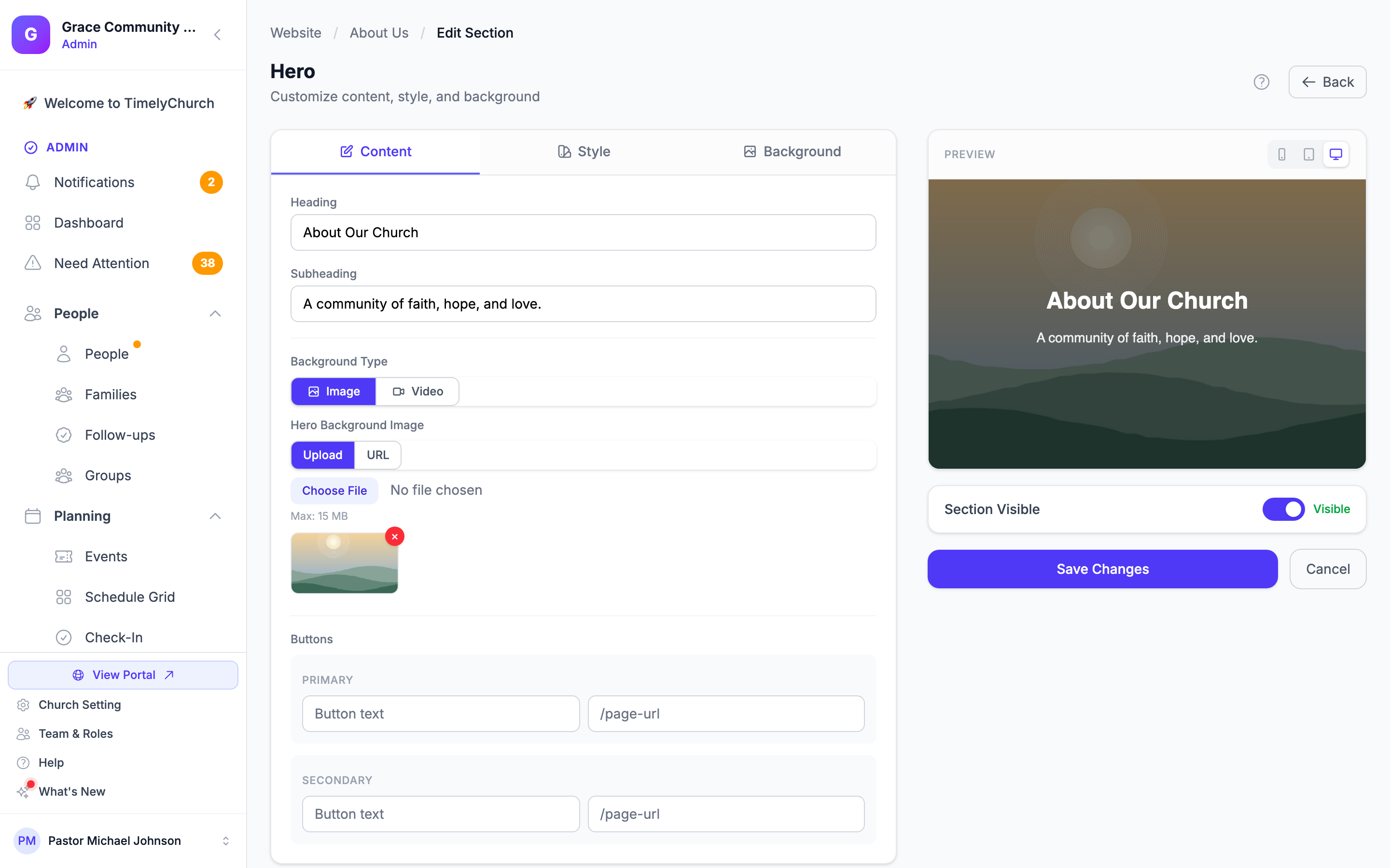
Content
The content area changes based on the section type:
- Hero sections have fields for heading, subheading, background image or video (upload or URL), and primary button text/URL.
- Content sections have a heading field and a body content area that supports HTML.
- Dynamic sections (Events, Staff, Groups, etc.) have heading and subheading fields. The actual data is pulled automatically from the matching part of TimelyChurch.
- Giving sections have heading, subheading, description, button text, and an optional give URL.
- Contact Form sections let you choose between the default contact form or a form from your Forms module.
- FAQ sections let you edit individual question-and-answer pairs.
- Beliefs sections let you edit individual belief items with title, description, and scripture reference.
- Testimonials sections let you edit individual testimonials with name and quote, and (with Show "Watch Video Story" (inline player) on) an optional video for each. See "Inline Video in Gallery & Testimonials" below.
- Next Steps sections let you configure individual step cards with title, description, URL, and icon.
- Sermon sections have heading, subheading, and call-to-action text/URL.
- Gallery sections let you upload multiple images at once and/or add image URLs, then pick a Grid, Masonry, or Carousel layout. See "Gallery Images: Upload or Link" below.
- Image + Text sections pair one image (upload or URL) with a heading and a rich-text paragraph, with the image placed left, right, or on top and styled by shape and size. See "The Image + Text Section" below.
- File Downloads sections let you upload files (PDF, Word, Excel, and more) and give each one a label; they render as download cards with a file-type badge and size. See "The File Downloads Section" below.
- Cards / Ministries sections let you build a grid of clickable tiles, each with an optional image, a title, a short description, and a link. See "The Cards / Ministries Section" below.
- Give Now Button sections show a single giving button (with optional heading and subtext) that links to your giving page by default. See "The Give Now Button" below.
- Prayer Wall sections show approved public prayer requests, and can optionally turn on a moderated visitor submit form and an "I prayed" counter. See "Prayer Wall: Public Submissions & Moderation" below.
Settings
Settings vary by section type but commonly include:
- Section Visible -- Toggle whether the section appears on the public page.
- Height (Hero) -- Choose from Small, Medium, Large, or Full Screen.
- Alignment (Hero) -- Left, Center, or Right alignment for text.
- Number of items to show (Events, Groups, Announcements, etc.) -- Control how many items display.
- Columns (Staff, Groups, Gallery, Cards / Ministries) -- Choose 2, 3, or 4 columns.
- Padding -- Control vertical spacing: Small, Normal, or Large.
Hero Image Overlay Controls:
- Overlay Darkness -- A slider from 0% to 100% controlling how dark the overlay appears over your background image.
- Overlay Color -- Pick the color of the overlay (default is black).
- Background Blur -- A slider from 0px to 20px to blur the background image for better text readability.
Background
Every section can have a custom background:
- None -- Uses the default page background.
- Solid Color -- Pick a specific background color using the color picker.
- Image -- Upload an image or provide a URL. When using an image background, you can configure overlay darkness, overlay color, background blur, and text color (light or dark).
- Click Save Changes when done.
Live Preview with Device Switcher
While you are editing a section, the right side of the editor shows a live preview of the rendered section inside an iframe. The preview updates automatically as you change content and settings.
At the top of the preview card you will find a device switcher with three buttons:
- Mobile -- Constrains the preview to 375px wide, matching a typical phone.
- Tablet -- Constrains the preview to 768px wide, matching a typical tablet.
- Desktop -- Lets the preview use the full available width.
Tip: Always sanity-check your sections in mobile width. Hero text, button placement, and column counts often need to be adjusted to look right on phones.
Naming a Section
Each section card shows a name so you can tell your sections apart: the section's own heading (or subheading) if it has one, with the section type underneath -- or just the section type if it has no heading. To give a section a name of your own, click the pencil (Rename section) next to its name on the card, type the new name, and press Enter. The name is only shown to you in the editor; visitors never see it.
Toggling Section Visibility
You can quickly show or hide a section without deleting it:
- In the page editor, click the eye icon (Toggle Visibility) on the section card.
- The section will toggle between visible and hidden.
- Hidden sections show a "Hidden" label and will not appear on the public page.
Deleting a Section
- In the page editor, click the delete (trash) icon on the section card.
- Confirm the deletion when prompted.
Important: Deleting a section permanently removes it and its content. This cannot be undone.
Next Steps
- Customizing Design -- Learn about themes, colors, and fonts
- Staff Directory -- Set up your staff/leadership page