
Adding a Row of Buttons (and Choosing Icons)
Most churches want two or three buttons across the page — Plan a Visit, Watch Online, Give. The Button Row section does exactly that: up to four buttons side by side, each with its own link, colour, and icon.
On a phone the buttons stack one under another at full width, so they stay easy to tap.
Adding a Button Row
- Go to Website Studio > Pages and open your page.
- Click Add Section.
- Choose Button Row (in the Interactive group).
It arrives with three buttons already filled in, so you can see how it looks immediately. Edit them, or remove the ones you do not need.
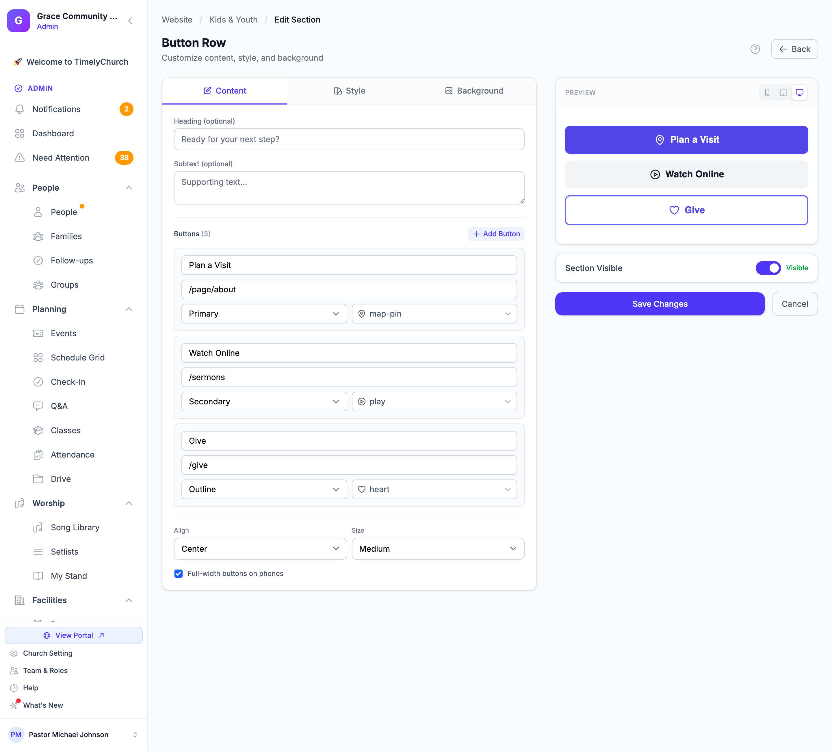
Editing the buttons
Click the edit (pencil) icon on the Button Row section. Under Buttons you will see a card per button, and a counter showing how many you have used (for example, 3/4).
For each button:
| Field | What it does |
|---|---|
| Button text | What the visitor reads, e.g. Plan a Visit. |
| Link | Where it goes. Use a page on your site (/page/about, /sermons, /give) or a full web address (https://…). |
| Style | Primary (solid, your main colour), Secondary (soft grey), or Outline (bordered). |
| Icon | Optional. See below. |
| Open in a new tab | Tick for links to other websites. |
Use Add Button to add another (up to four), and the x on a card to remove one. A button with no text or no link is simply skipped, so a half-filled card never shows up as an empty box on your live page.
Tip: Give one button the Primary style and the others Secondary or Outline. If every button is primary, none of them stands out.
Row settings
| Setting | What it does |
|---|---|
| Align | Left, Center, or Right — where the row sits on the page. |
| Size | Small, Medium, or Large buttons. |
| Full-width buttons on phones | On by default. Each button spans the screen on a phone, which is much easier to tap. Turn it off if you want them to stay compact. |
Choosing an icon
Anywhere TimelyChurch asks for an icon, you get a picker rather than a text box: click the icon field and choose from a grid, grouped by theme — Common, Church life, People, Family & hospitality, Getting here, Contact, and Giving & media. Choose No icon to leave it off.
What you pick is what appears. Previously some places let you type an icon name and quietly drew something else if the name was not recognised; that is gone.
The picker is used in:
- Button Row — an icon per button
- Columns — on Button and Icon blocks
- Giving — the icon shown with your donation call-to-action
- Next Steps and Plan Your Visit — the icon on each step
- Announcement Banner — the icon in the banner
- Launcher Widget — the icon on each quick link
Note: Icons were refreshed to a newer, more consistent set. Existing choices were kept, so your pages keep the icons you picked — a few just look slightly cleaner. Two changed shape because they were previously mislabelled: gift now draws an actual gift, and coffee looks like a cup.
Button Row or Columns?
Both put things side by side, so:
- Just buttons? Use Button Row. It is quicker and made for it.
- Buttons plus text, images, or whole sections? Use Columns, which can hold a button block in each column alongside anything else. See Putting Sections Side by Side.
Related articles
- Putting Sections Side by Side (Columns)
- Website Sections
- Customizing Design — where your primary colour comes from