
Customizing Your Website Design
Website Studio includes a full design customization system with pre-built themes, custom color overrides, typography options, and header/footer style choices. All design settings are managed from the Theme & Colors page.
Accessing Theme Settings
- Click Website in the left sidebar to open Website Studio.
- Click the Theme & Colors card on the dashboard.
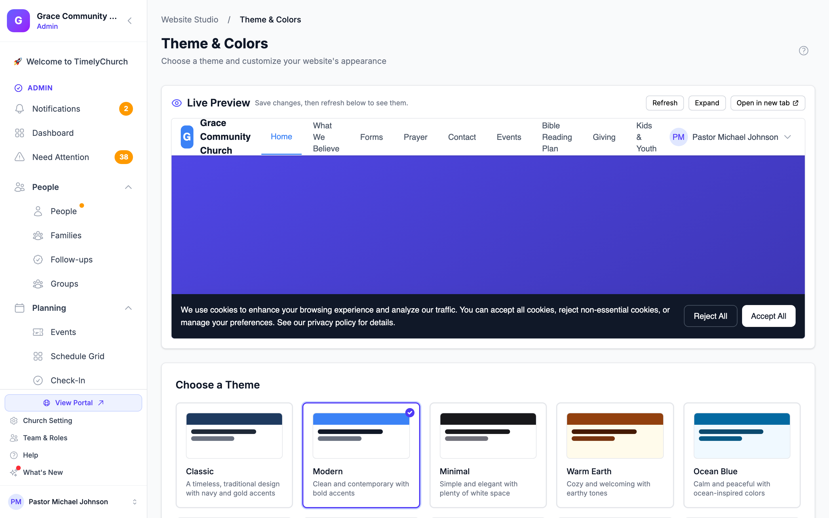
The Live Preview
At the top of the page, Live Preview shows your public website as visitors see it. Save your changes, then click Refresh to see them in the preview. Expand makes the preview taller; Collapse shrinks it again.
Choosing a Theme
Website Studio includes 10 professionally designed themes. Each theme provides a complete set of colors, fonts, border radius, and shadow styles.
Available Themes
| Theme | Description | Style |
|---|---|---|
| Classic | Timeless, traditional design with navy and gold accents | Serif headings, subtle shadows |
| Modern | Clean and contemporary with bold blue and violet accents | Sans-serif, rounded corners |
| Minimal | Simple and elegant with plenty of white space | Neutral tones, no borders or shadows |
| Warm Earth | Cozy and welcoming with earthy amber tones | Serif headings, warm shadows |
| Ocean Blue | Calm and peaceful with ocean-inspired sky blue colors | Rounded corners, soft shadows |
| Forest Green | Natural and refreshing with green accents | Serif headings, subtle shadows |
| Sunset Orange | Vibrant and energetic with warm orange tones | Extra-rounded corners, warm shadows |
| Royal Purple | Elegant and sophisticated with royal purple accents | Decorative serif headings |
| Slate Gray | Professional and modern with neutral gray tones | Sans-serif, small borders |
| Midnight Dark | Bold dark mode design for modern churches | Dark background, glowing accents |
How to Select a Theme
- On the Theme & Colors page, browse the theme cards under Choose a Theme.
- Each card shows a color preview, the theme name, and a brief description.
- Click on a theme card to select it. A checkmark will appear to confirm your selection.
- Scroll to the bottom and click Save Theme Settings.
Tip: The theme previews show you the primary color bar, text color, and background color so you can get a sense of the look before selecting.
Customizing Colors
You can override the theme's default colors with your own brand colors. This lets you use a theme's layout and structure while matching your church's branding.
Available Color Overrides
- Primary Color -- Used for buttons, links, and accent elements.
- Secondary Color -- Used for secondary interface elements.
- Accent Color -- Used for highlights and special elements.
How to Customize Colors
- On the Theme & Colors page, scroll to the Customize Colors section.
- For each color:
- Click the color swatch to open the color picker.
- Select your desired color.
- The hex code will be displayed in the text field beside the picker.
- Click Save Theme Settings to apply.
To reset colors back to the theme defaults, click the Reset to theme defaults link at the bottom of the colors section.
If a color you pick is too light to read white text on, a warning appears under it: "Low contrast against white text (WCAG AA recommends 4.5:1)". Choose a darker shade so buttons stay readable.
Tip: If you leave a color field empty, the theme's default color for that slot will be used. You do not have to override all three colors -- just the ones you want to change.
Choosing Fonts
You can customize the heading and body fonts independently.
Available Fonts
| Font | Style |
|---|---|
| System Default | The device's default sans-serif font |
| Inter | Modern, clean sans-serif |
| Poppins | Geometric, friendly sans-serif |
| Montserrat | Bold, geometric sans-serif |
| Georgia | Classic serif |
| Merriweather | Readable serif |
| Lora | Elegant serif |
| Playfair Display | Decorative display serif |
How to Change Fonts
- On the Theme & Colors page, scroll to the Typography section.
- Select a font from the Heading Font dropdown.
- Select a font from the Body Font dropdown.
- Click Save Theme Settings.
Selecting "Use theme default" will use whatever font is defined by your selected theme.
Header Styles
The header style controls how your site navigation appears at the top of every page.
Available Header Styles
| Style | Description |
|---|---|
| Classic | Logo on the left, navigation links on the right |
| Centered | Logo centered at the top, navigation links below |
| Transparent | Overlays the hero image (great for image-heavy home pages) |
| Modern | Logo on the left, navigation centered, call-to-action button on the right |
| Minimal | Logo and a hamburger menu icon only |
How to Choose a Header Style
- On the Theme & Colors page, scroll to the Header Style section.
- Each option includes a visual preview showing the layout.
- Click your preferred style.
- Click Save Theme Settings.
Footer Styles
The footer style controls the layout of the bottom of every page.
Available Footer Styles
| Style | Description |
|---|---|
| Full | Multi-column footer with contact info, navigation links, and social media (the default) |
| Minimal | A single line with copyright text and social media icons |
| Centered | Everything centered: logo, navigation links, social icons, and copyright |
| Grand | Large, prominent footer with branding, a call-to-action, and multiple columns |
How to Choose a Footer Style
- On the Theme & Colors page, scroll to the Footer Style section.
- Each option includes a visual preview.
- Click your preferred style.
- Click Save Theme Settings.
Forms Page Layout
Forms Page Layout sets how the list of your forms looks to visitors on your website's forms page. Every option adapts to phones and tablets:
| Layout | Best for |
|---|---|
| Cards | Large tiles with an icon banner — best for a handful of forms |
| Compact grid | Smaller tiles, more per row — good for many forms |
| List | One per row, quick to scan |
| Detailed list | One per row with the full description |
Click the layout you want, then click Save Theme Settings.
Church Logo
Your church logo appears in the website header and is configured in your church settings:
- Open Church Settings (the Church Setting link at the bottom of the sidebar) and stay on the Profile tab.
- Upload your logo image.
- The logo will automatically appear on your website based on your header style settings.
You can control whether the logo displays in the header from the Navigation settings (see Navigation & Menus).
Saving Your Design Changes
All theme, color, font, header, forms-layout, and footer changes are saved together when you click Save Theme Settings. Changes take effect immediately on your public website -- there is no separate publish step for design settings.
Next Steps
- Navigation & Menus -- Configure your site menu, header, and footer content
- SEO Settings -- Optimize your website for search engines