
Form Field Types
TimelyChurch Forms gives you a palette of 24 field types organized into four groups in the form builder: Inputs, Choices, Special, and Layout. The headings below use the names shown in the palette. Use the right field type for each piece of data you want to collect -- the type determines how the field renders, how it is validated, and (for some fields) how it can be mapped to a Person profile.
Adding Fields
From the form editor, you can add fields in two ways:
- Click to add -- Click any field type in the left sidebar palette (on smaller screens, tap the Add Field button) to add it to the bottom of your form.
- Reuse Profile Fields -- If you have custom Person fields defined, they appear in a separate Profile Fields palette at the top of the sidebar. Clicking one adds it with automatic profile mapping pre-configured (you will see a small "Profile" badge on the field).
Once added, you can:
- Drag to reorder fields using the drag handle on the left side of each field
- Edit any field with the pencil icon to open the slide-over editor (clicking the field's body also opens it)
- Duplicate a field to create a copy
- Delete a field (you will be asked to confirm; existing submission data is preserved)
Input Fields
Text Input
A single-line text field for short responses.
- Use for: Names, short answers, custom identifiers
- Settings: Placeholder text, min/max length validation, required toggle
- Width options: Full Width, Half Width, One Third
Text Area
A multi-line text field for longer responses.
- Use for: Comments, prayer requests, detailed descriptions
- Settings: Placeholder text, min/max length validation, required toggle
A text field with email validation built in.
- Use for: Collecting email addresses
- Validation: Automatically validates proper email format
- Settings: Placeholder text, required toggle
Phone
A text field designed for phone numbers.
- Use for: Collecting phone/mobile numbers
- Settings: Placeholder text, required toggle
Number
A numeric input field.
- Use for: Ages, quantities, dollar amounts, any numeric value
- Validation: Only accepts numeric input
- Settings: Min/max value validation, placeholder text, required toggle
- Tip: Set an optional Price per unit (USD) on a Number field to turn it into a paid quantity -- the form charges (quantity × unit price). See Payment (Card) below.
- Per-person minimum surcharge (optional): On a paid quantity, set Minimum people and Surcharge each below (USD). If fewer than the minimum are entered, the form charges the surcharge for each missing person (e.g. min 4, $25 each → 2 people adds $50). Leave blank to skip.
Date
A date picker field.
- Use for: Birthdates, event dates, start dates
- Validation: Validates proper date format
- Settings: Required toggle, Age Eligibility (see below)
Age Eligibility
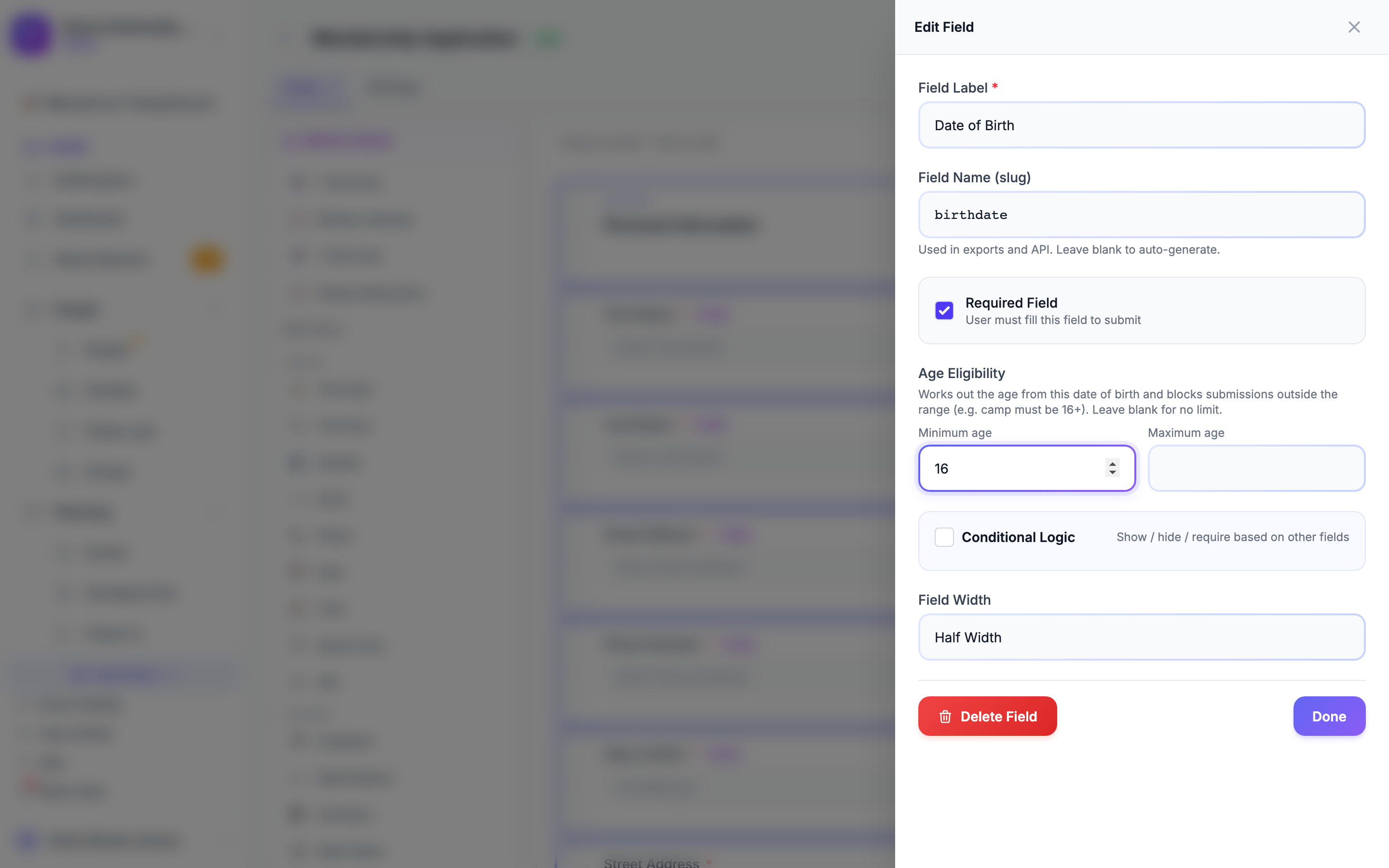
On a date-of-birth field, set Minimum age and/or Maximum age under Age Eligibility. TimelyChurch works out the person's age from the date they enter and blocks submissions outside the range -- for example, a camp that is 16 and older. The person sees "You must be at least 16 years old." (or "You must be … years old or younger.") and can't submit until the date fits. Leave both blank for no limit. Age Eligibility is available on Date and Date & Time fields.
Time
A time picker field.
- Use for: Preferred contact times, availability windows
Date & Time
A combined date and time picker.
- Use for: Appointment scheduling, event timestamps
URL
A text field with web-address validation built in.
- Use for: Website links, social media profiles, online portfolios
- Validation: Validates proper URL format
- Settings: Placeholder text, required toggle
Choice Fields
Dropdown (Select)
A single-selection dropdown menu.
- Use for: Selecting one option from a list (e.g., T-shirt size, service time, campus)
- Settings: Add/remove options, required toggle
Multi-Select
A field that allows selecting multiple options using checkboxes.
- Use for: Skills, interests, availability (multiple days), dietary restrictions
- Settings: Add/remove options, required toggle
Radio Buttons
A set of mutually exclusive options displayed as radio buttons.
- Use for: Yes/No/Maybe, choosing a single preference from a short list
- Settings: Add/remove options, required toggle
Checkbox
A single or group of checkboxes.
- Use for: Agreements, opt-ins, single Yes/No questions
- Settings: Add/remove options, required toggle
Yes / No
A simple toggle for binary choices.
- Use for: Consent forms, simple confirmations, boolean questions
Priced Options
On a Dropdown, Radio Buttons, Checkbox or Multi-Select field, each option has an optional Price box. "Add a price to any option to charge for it (e.g. Ladies $140, Guys $160). Picking one priced option adds its price to the form total. Leave the price blank for a normal choice." A form with priced options collects payment by card just like a Payment field -- see Payment Forms.
Special Fields
The Special group in the builder palette covers richer input types -- file uploads, signatures, composite fields, hidden values, repeating groups, and the Payment field.
File Upload
Allows respondents to upload a file with their submission.
- Use for: Resumes, photos, signed documents, supporting materials
- Settings: Allowed File Types (comma-separated extensions; "Defaults to the system-wide limit when blank."), max file size (MB), required toggle
- Note: For security, uploads are limited to common attachment types (images, PDFs, Office documents, text, ZIP) with a size cap.
Signature
A signature capture field.
- Use for: Consent forms, waivers, agreements requiring a signature
Address
A composite field for capturing a full mailing address (street, city, state, postal code).
- Use for: Home addresses, mailing addresses
Name (First/Last)
A composite field for capturing a person's full name (first name and last name).
- Use for: Structured name collection
Hidden Field
A hidden field that is not visible to the respondent but can carry a fixed value (e.g., a campaign source, a referral ID).
- Use for: Tracking where submissions come from, passing metadata
- Settings: Default Value (the value submitted with the form)
Repeater Group
Allows respondents to add multiple entries of a set of sub-fields (e.g., adding multiple children to a registration).
- Use for: Registering multiple people, listing multiple items
- Settings: Item Label, Min Rows / Max Rows, and a sub-field designer (define the inputs -- Text, Email, Phone, Number, Date, or Select -- shown side-by-side in each row)
Payment (Card)
The Payment (Card) field lets your form collect a card payment at submission time. It is powered by Stripe through your church's Stripe Connect account, so the money lands in your own Stripe account.
- Use for: Registration fees, deposits, paid sign-ups, donations tied to a form
- Settings: A fixed Amount (USD) charged by the form (on the canvas the field shows Set amount → until you enter one)
- Pricing options: The form total can come from a fixed amount (set on the Payment field), a per-unit quantity charge (set a Price per unit on a Number field, and the form charges quantity × unit price), and priced options on choice fields. The total is always worked out again by TimelyChurch when the form is submitted, so it can't be changed from the person's browser.
- What happens on submission: The respondent enters their card details in a Stripe card form, the charge is processed, and the submission is recorded along with the payment. Each paid submission posts to your Fundraising income and is recorded as a transaction so it shows up in your finance records.
- Refunds: A paid submission can be refunded from its linked record.
Before you go live with payments: Your church must have Stripe connected -- in Church Settings, open the Integrations tab and use the Stripe - Online Giving card (see Setting Up Online Giving). Stripe's minimum charge is $0.50.
Layout Fields
Layout fields do not collect data -- they help organize and structure your form visually.
Section Header
Adds a heading to break your form into logical sections.
- Use for: Separating groups of related questions (e.g., "Personal Information", "Emergency Contact")
Instructions
Adds instructional text or a paragraph of content within the form. Supports rich text formatting via a built-in editor.
- Use for: Providing directions, explanations, or disclaimers between fields
Page Break
Splits the form into multiple pages. Respondents will see a "Next" button to proceed.
- Use for: Long forms that benefit from being broken into manageable steps
A Note on Event Registration Dates
When a form is set up to register people for an event series (a recurring event with multiple dates), TimelyChurch automatically adds an Event Date Picker to the top of the form so respondents can choose which date they are registering for. This field is added for you -- you do not add it manually from the palette.
Editing a Field
Click the edit (pencil) icon on any field to open the slide-over editor. Depending on the field type, you can configure:
| Setting | Available For | Description |
|---|---|---|
| Label | All fields | The label displayed above the field |
| Field Name (slug) | All fields | A short name for the field, used when you export submissions; generated from the label if you leave it blank |
| Placeholder / Help Text | Text Input, Text Area, Email, Phone, URL, Number | Hint text shown inside the empty field |
| Options | Dropdown, Radio Buttons, Multi-Select, Checkbox | The list of choices available to the respondent, each with an optional Price |
| Required | All data fields | Whether the field must be filled in to submit the form |
| Validation Rules | Text Input, Text Area, Number | Min Length / Max Length (text) or Min Value / Max Value (number) |
| Age Eligibility | Date, Date & Time | Minimum age / Maximum age worked out from a date of birth |
| Conditional Logic | Most fields | Show, hide or require the field based on other answers (see below) |
| Field Width | All fields | Full Width, Half Width, or One Third -- controls how much horizontal space the field takes |
Tip: Use Half Width and One Third fields to place multiple fields side-by-side, such as First Name + Last Name (two halves), or City + State + ZIP (three thirds).
Reordering Fields
Drag any field using the grip handle on its left side to reorder it within the form. The new order is saved automatically when you drop the field.
Saving Changes
When you make changes to fields, an Unsaved indicator appears at the top of the form canvas. Click Save to keep all your changes at once -- you'll see "Fields saved successfully!"
Conditional Logic (Show / Hide / Require Rules)
Conditional logic lets a field react to answers given elsewhere on the form -- for example, "only show 'Spouse Name' if 'Marital Status = Married'", or "require 'Allergy Details' only when 'Has Allergies = Yes'".
To set it up, open a field in the editor, scroll to the Conditional Logic section ("Show / hide / require based on other fields"), and turn on the toggle. Then configure:
- Action -- what to do when the rules match: Show this field, Hide this field, or Require this field.
- Match -- All rules below (AND) or Any rule below (OR).
- Rules -- one or more rows, each made up of a trigger field, an operator, and a value. Add as many rules as you need.
The available operators include: Equals, Does not equal, Contains, Does not contain, Begins with, Ends with, Greater than, Less than, Is filled, Is empty, Before (date), After (date), Is one of, and Is none of. For "Is one of" / "Is none of", separate the values with commas.
The rules are evaluated when the form is filled out, and again on the server when it's submitted -- so a hidden field is never validated, and a conditionally-required field is enforced only when its rule matches.